Goal Satisfaction Through News Topics
Summary
This project explored whether curated topic collections, delivered in-context while reading, could give users a structured way to go deeper, leaving them with a genuine sense of understanding by the time they finished.
This work is now 10 years old, but I believe the path we took and the underlying strategy that guided it are more relevant than ever. It exemplifies where UX value truly lies, and what remains scarce right now: problem definition, clarifying intent, and establishing the conditions for effective action.
Client: The New York Times
Role: UX & UI design, user research, prototyping
Impact: Deeper engagement through curated topic paths
Timeline: 2015
Opportunity
Readers want to make the most of their limited time online while staying genuinely informed about topics that matter to them. This project explored whether focused collections of articles could meet that need, deepening understanding of specific topics while giving readers a sense of accomplishment when they finished.
Experience Principles
Our work at The New York Times was grounded in self-determination theory, which holds that autonomy, competence, and relatedness are the core drivers of human motivation. Products that support these needs tend to feel more personal, meaningful, and memorable.
Target Customers
We had two NYT personas in mind, both of whom arrive at an article with a genuine desire to understand a topic, not just skim a headline.
The "Voice of Authority" wants to stay current so they can speak knowledgeably in their social circles. They actively seek depth on topics they care about.
The "Explorer" is motivated by both breadth and depth. They follow related links and are willing to spend real time on a subject.
Scope & Constraints
Our team's mission at The Times was to foster innovation by identifying, refining, and validating product opportunities for core offering, building a backlog of features we could bring to market with confidence.
This project covered defining the opportunity, building a live data prototype that simulated a realistic environment, and testing it with actual NYT customers.
At the time, non-subscribers operated under a metered paywall, so we had to account for the possibility that users would be reluctant to spend multiple page views on a single topic. The solution also had to coexist with the existing reading experience without disrupting normal behavior.
From Hypothesis to Tested Prototype
A snapshot of our process:
Product Opportunity Assessment
Before any design work, we drafted a product opportunity assessment to evaluate whether this was worth pursuing at all. That meant stress-testing the value for both users and the business, identifying the riskiest assumptions, and defining what success would look like. It gave the team a shared foundation before we attempted to design anything.
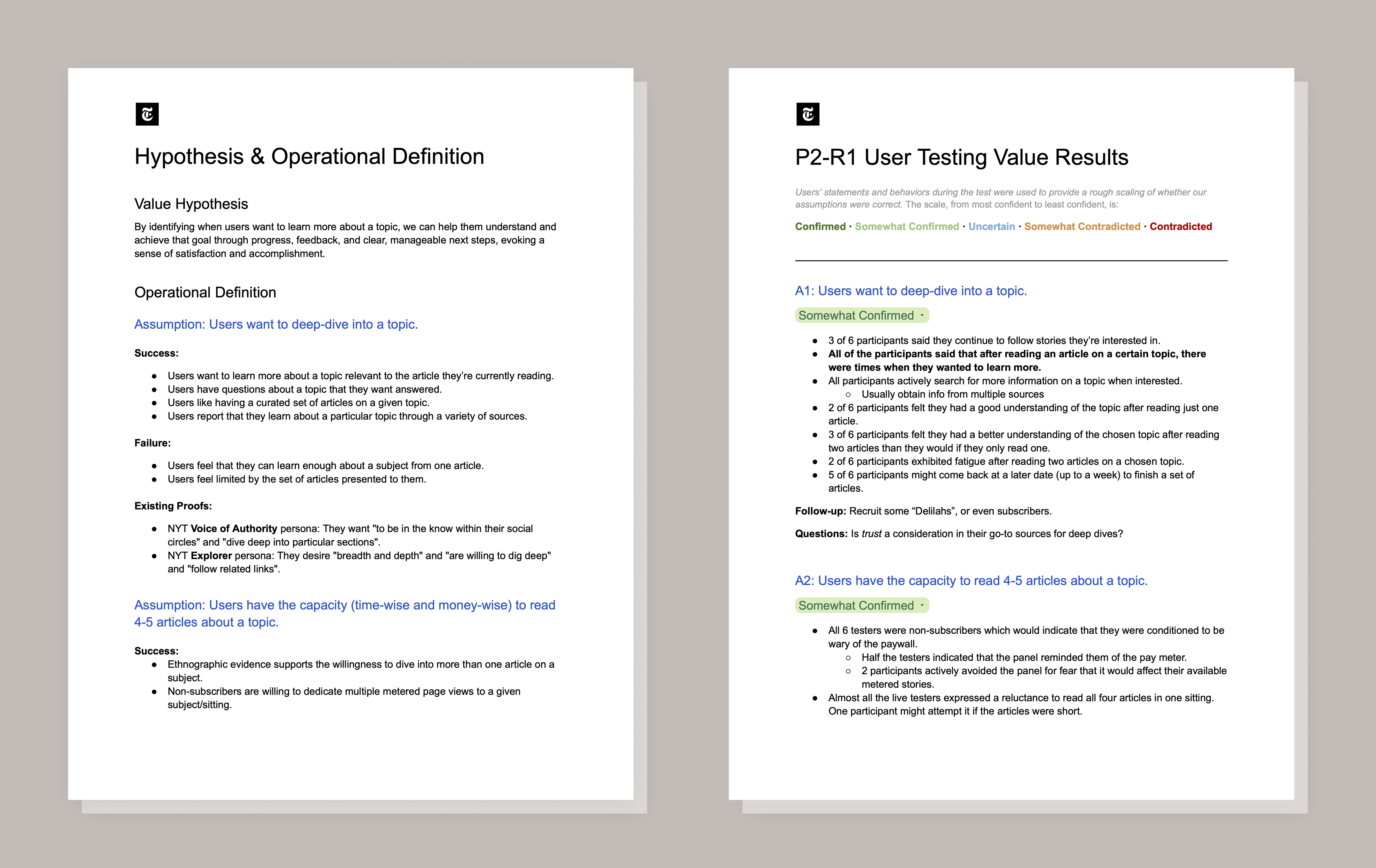
Value Hypothesis and Assumptions
We structured our beliefs as six explicit, testable assumptions. For each one, we wrote operational definitions with concrete success and failure criteria, giving the team a shared lens for evaluating what user tests would tell us.
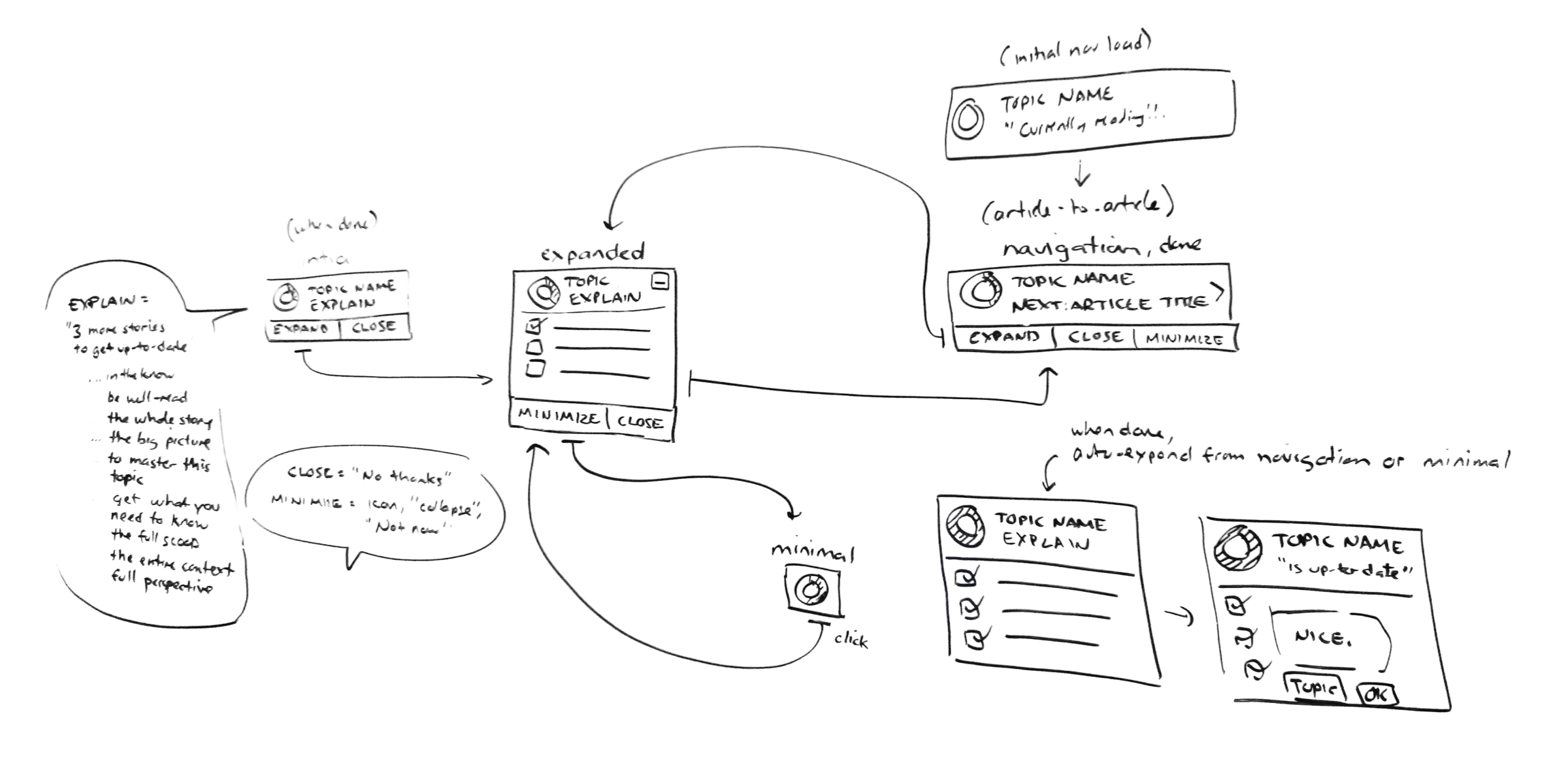
Ideation and Prototyping
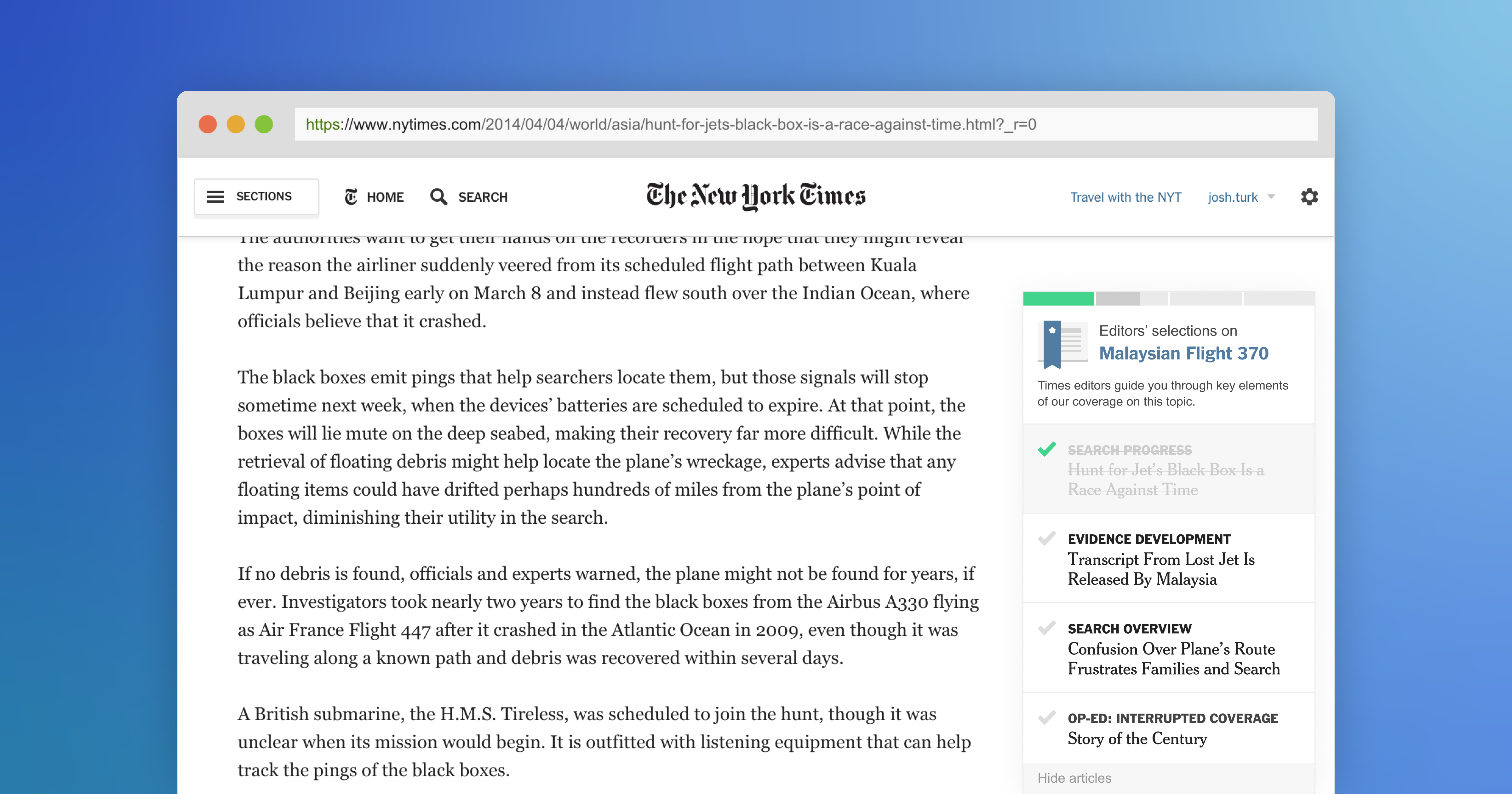
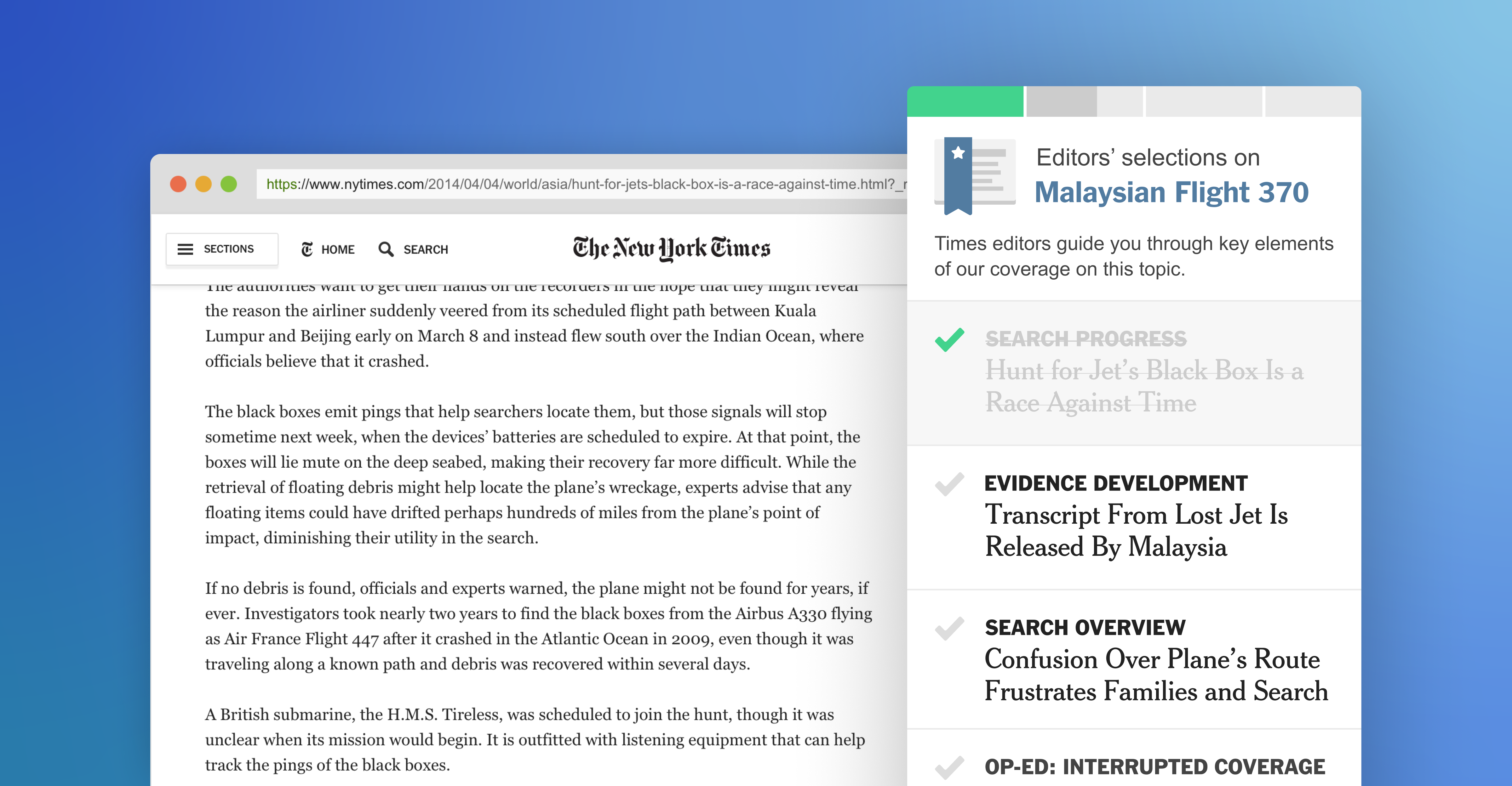
We conducted group ideation sessions using a whiteboard to generate a range of concepts before deciding on a particular direction. The concept we moved forward with was a persistent panel that appeared while reading an article, surfacing a curated set of 4 to 5 related articles with progress tracking and completion feedback. We built a working prototype using live data simulation to keep the test experience authentic.
Testing and Evaluation
We wrote a test plan and moderation guide, then ran six moderated usability sessions. Each included contextual interviews to understand existing reading behavior, task-based observation, a satisfaction survey, and card sorting using Product Reaction Cards to capture emotional responses. We each took turns moderating.
Synthesis
We synthesized findings across usability sessions, survey data, and card sort results. I mapped each finding back to our six assumptions and rated confidence on a five-point scale from Confirmed to Contradicted. This structure let me communicate findings with precision rather than vague impressions.
Key Findings
Our first round of testing produced mixed results.
Desire to go deeper
Readers generally wanted to dig deeper on topics of interest. Nearly all participants said they had used other services to learn more about a subject.
Reading capacity
Opinions were mixed on the optimal number of articles per collection. Some participants were concerned about what might be left out.
Comprehension of the set
Most participants noticed the panel in the first round of testing but did not engage with it, mistaking it for a paywall meter. We had to rethink the visual design and initial language.
Motivation mechanics
Some participants found the gamification and upbeat tone patronizing. After dialing those elements back, perception of the feature improved significantly.

Design Recommendations
The underlying feature was worth refining. The paywall confusion and tone problems had the highest impact on trust and adoption. We made four changes, which led to stronger performance in the next round of testing:
- Redesigned the panel so it looked nothing like the paywall meter. One in three participants had avoided engaging because of that association.
- Toned down the gamification. Reframed the language around curation and editorial value rather than task completion. Users are reading the news, not playing a game.
- Added visible curation context. Made it clearer that the selected articles were a hand-picked subset by the newsroom, not the full body of NYT coverage on the topic.
- Lowered the barrier to completion. Reduced the set to three to four articles and made the time commitment more transparent upfront.